Delightful
Design by
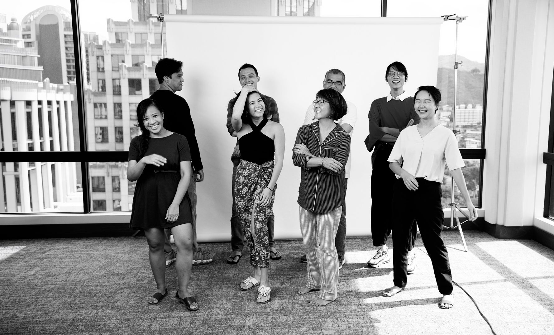
Good People
Sae Design Group is a strategic creative studio rooted in Hawaiʻi. This is our brand guide — a living reference for how we look, sound, and show up across every touchpoint.
v2026 · Internal UseIn the spirit of ʻohana, we are a community-minded design studio bringing passion, expertise, partnerships, and results to all we serve. We listen. We are curious and committed to offering strategic branding that tells our client's story in a unique and remarkable way.
We Are:
Small but mighty. We believe every company has a unique story — and our job is to help tell it with honesty, craft, and staying power.
Approachable and unpretentious. We skip the jargon and talk to our clients like people.
Every project is a chance to make something that hasn't existed before. We take that seriously.
Good design is a conversation. We embed ourselves in our clients' world and build together.
A little wit goes a long way. We find moments of joy in the work — the banana in the box is always intentional.
Rooted in Hawaiʻi, but not in a tiki-torch way. We reflect the real texture of these islands.
Two offices, one ʻohana. Wailuku Maui and Kakaʻako Oʻahu — this place shapes everything we make.
Our Mark
Charming, distinctive, and a little bit impossible to unsee. The primary mark is a full horizontal lockup — wordmark and logomark together. For tighter spaces the standalone logomark holds its own. Additional tidbits below for apparel, merch, and informal use.
For apparel, merchandise, and informal use where the full logo may not be required.
Our Palette
Warm, vivid, and grounded. Coral and teal carry the brand; gold, sky, and cream give us room to breathe and play.
Type System
Work Sans does the heavy lifting. Atyp Display adds authority. Rosa Stencil brings warmth when a moment calls for it.
Spot Illustrations
A library of spot illustrations that give the brand texture and personality across campaigns, web, and print.


The Brand in the Wild
How we show up in print and digital collateral. The business card is the brand's first handshake — the email signature its daily voice.

